Warsaw / 2026
SPASS
Logotype and symbol
Logotype, symbol and app icon for the SPASS / SportyPass brand. The mark had to express sport and movement, and leave room to grow into a standalone brand in the future.
in collaboration with Internet Stars

01. Concept
Sport and movement
The SPASS logotype grew out of the client’s brief: it had to express sport and movement. I took inspiration from snow and from the tracks left by runners and skiers.
I wanted the logotype to have room to evolve and become the foundation of a standalone brand, so it was important to me that it stayed flexible for future work on the SPASS brand.
That is how the S came about, the SportyPass app icon, along with the full SPASS / SportyPass symbol and logotype in several versions.

02. Symbol
App icon
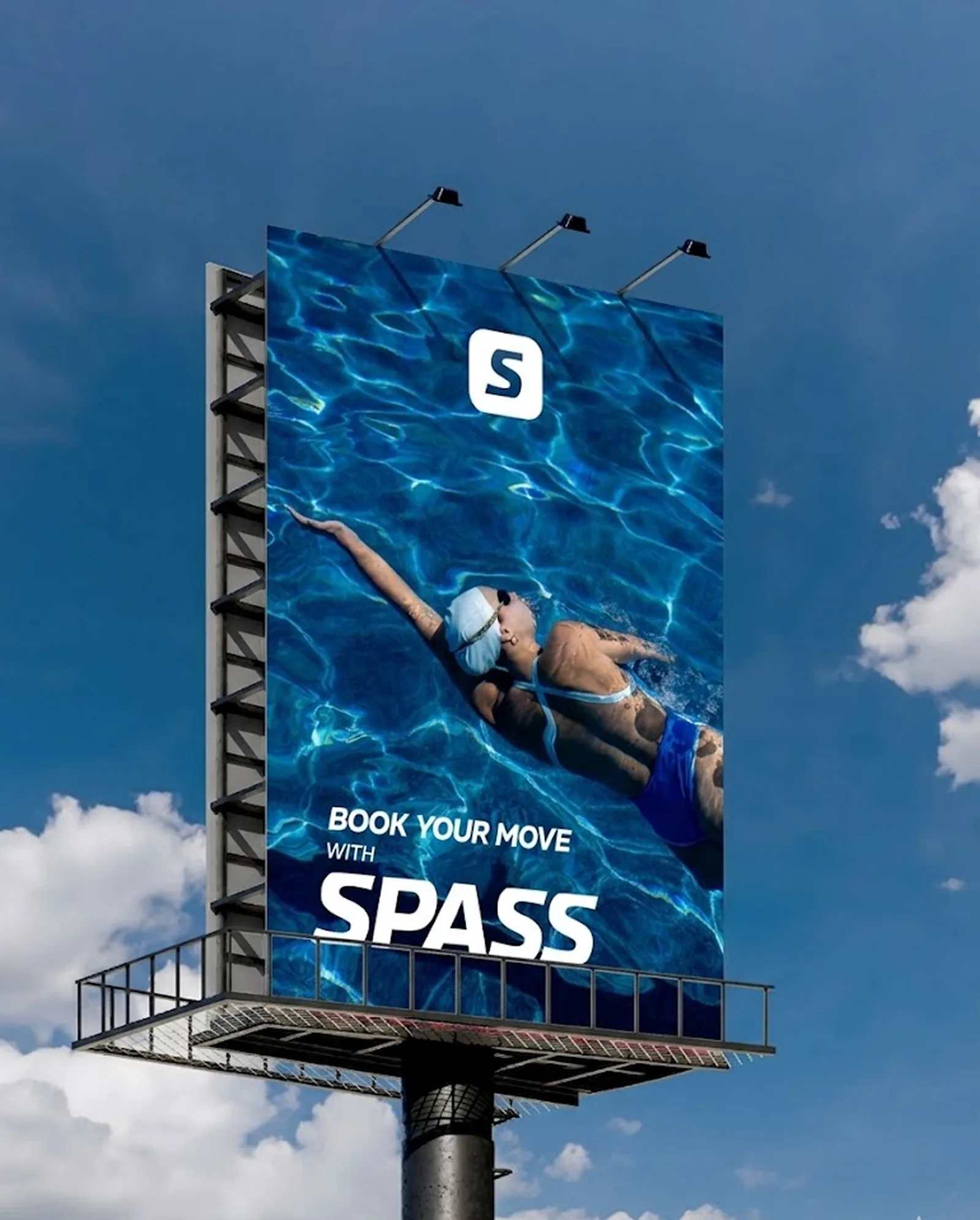
A slanted S inside a rounded square is the SportyPass app icon. The same mark also works on its own on posters, outdoor ads and social media.


03. Logotype
SPASS and SportyPass
The logotype comes in a short SPASS version and a full SportyPass version, in the brand color, in white and in a frame that turns the wordmark into a bold graphic sign.






04. Color
Brand palette
SP Blue
Black
White
The lead color is SP Blue (#4C8EFF). The mark also comes in white and black, so it works on light backgrounds, on the brand color and on photos.
05. Applications
The brand in use
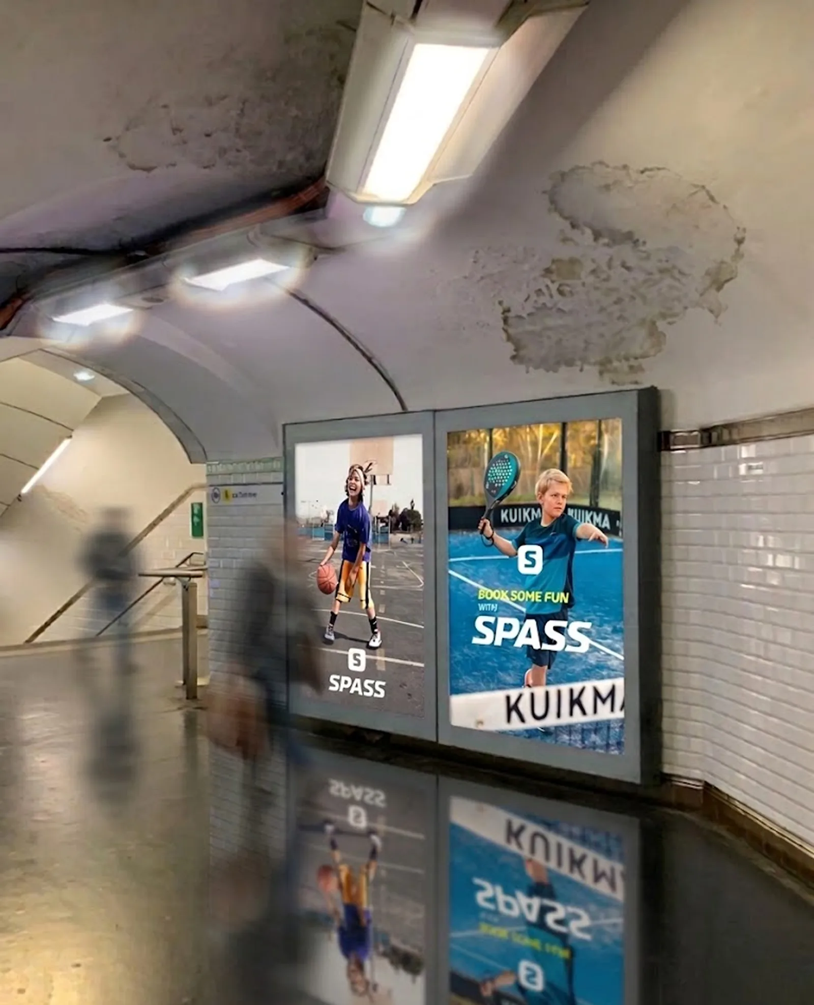
Visuals for the “Book your move with SPASS” campaign: a billboard, citylights in the subway, posters and a branded water bottle.