Porto, Portugal / 2023
Skeezos
Album cover
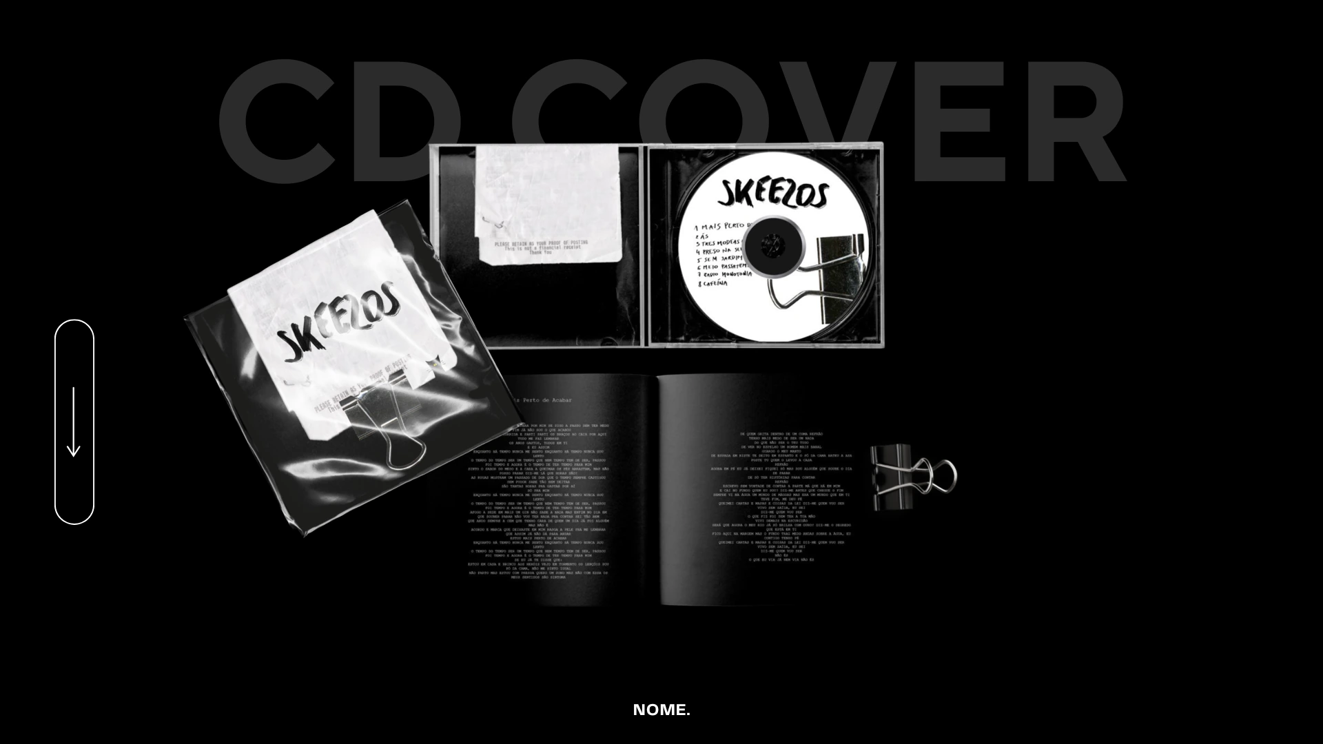
Cover design for the album “Mais Perto de Acabar” by the Portuguese band Skeezos. The cover shows a receipt clipped to a black T-shirt: a metaphor for a satisfying meal that has come to an end, and at the same time for the end of the process of making the album.

Project completed at Universidade Lusofona
Porto, Portugal · 2023
01. Concept
The receipt as a metaphor
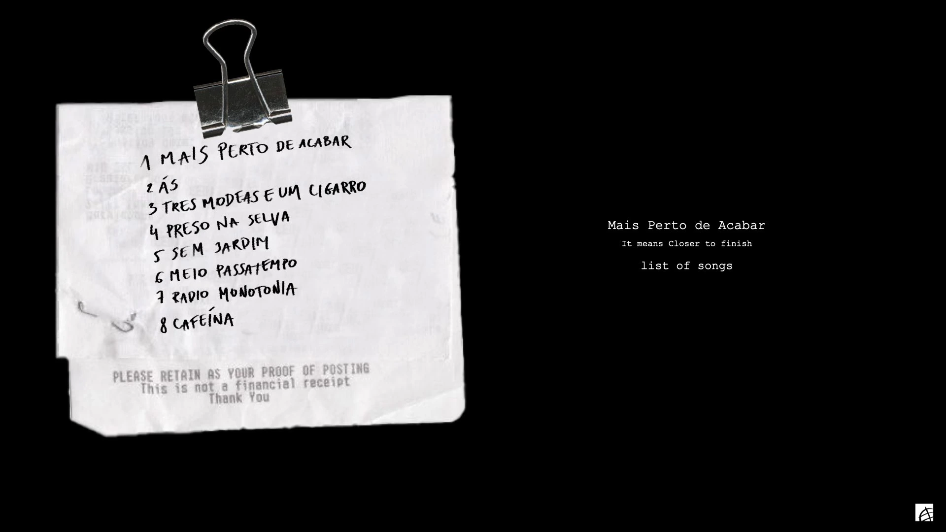
The album cover shows a receipt clipped to a black T-shirt. It is a metaphor for a satisfying meal that has come to an end, and a symbol of the end of a great time spent at a restaurant or a bar.
It refers directly to the songwriting process and to finishing work on the album. The title “Mais Perto de Acabar”, meaning “Closer to the end”, fits right into that story.
The tracklist is handwritten on the receipt: every title reads like an item on the bill, tying form and content together.
02. Typography
Hand lettering
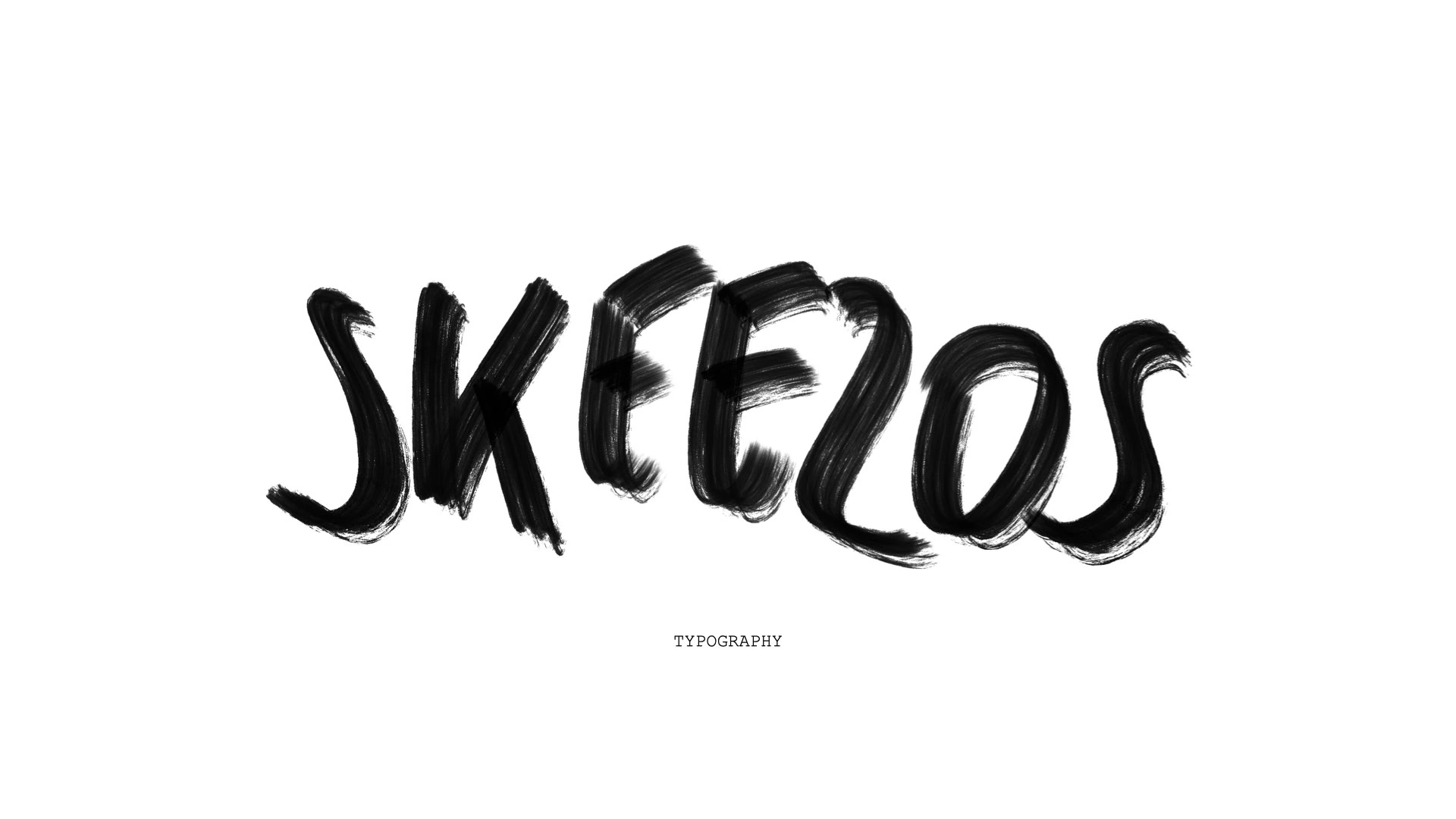
I chose hand lettering for the receipt to give it a personal touch and a sense of authenticity. Hand lettering feels more human and organic than standard print typefaces. It adds a subtle artistic layer that highlights the creativity and individuality of the project. It is also a visual nod to the handwritten lyrics and the creative process behind the album.
03. CD
Disc design
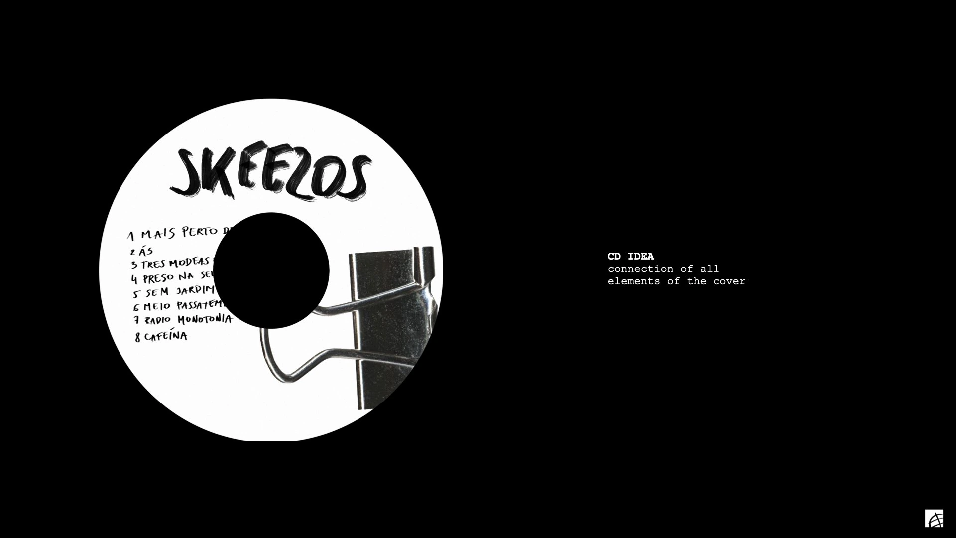
The CD design brings all the cover elements, the hand lettering, the binder clip and the tracklist, together in a cohesive circular format. The black-and-white palette keeps the raw, authentic character of the whole album.
Tracklist
Mais Perto de Acabar
As
Tres Moedas e um Cigarro
Preso na Selva
Sem Jardim
Meio Passatempo
Radio Monotonia
Cafeina
Project details
Band
Skeezos
Album
Mais Perto de Acabar
Technique
Hand lettering
Scope
Cover + booklet + CD
04. The full project
All elements
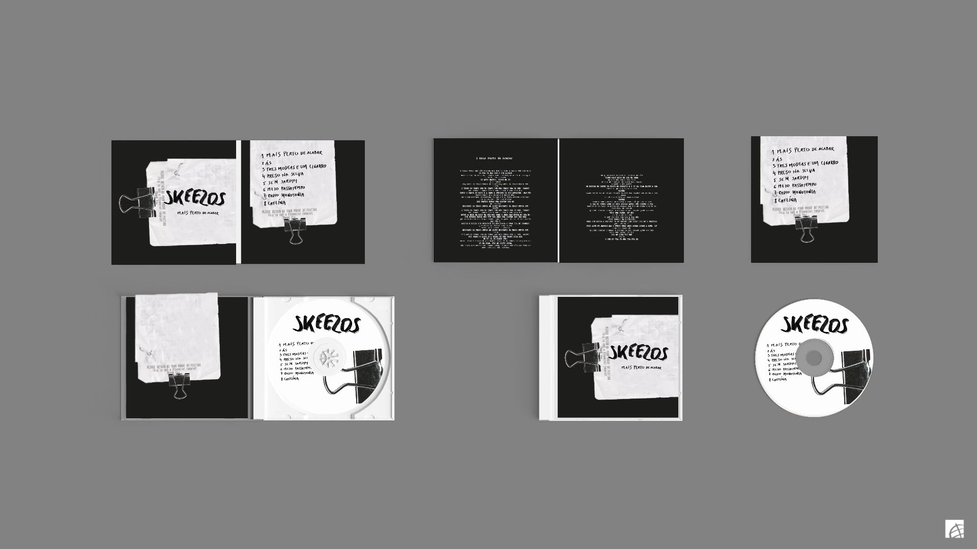
The full set of album elements: front and back cover, inner booklet spreads with lyrics, plastic sleeve and CD. Every element follows the same black-and-white aesthetic with hand lettering.
05. Design approach
Creative process
The receipt metaphor
The receipt as the central motif of the cover: it stands for the end of a meal and, at the same time, the culmination of the creative process. The binder clip holding the receipt adds a tactile, raw quality.
Hand lettering
Every piece of text on the cover and the disc was drawn by hand, from the band name to the song titles. The technique highlights the authenticity and organic character of Skeezos’ music.
A consistent system
The cover, lyrics booklet, sleeve and CD form one coherent visual system. The black-and-white palette and raw paper textures create a mood of intimacy and honesty.
06. Visual system
Album palette
Black
Paper
Graphite
Parchment
The palette is limited to black and white, with shades of gray and warm paper tones. The raw, monochrome aesthetic underlines the authenticity of the hand lettering and the intimate character of the band’s music.
Note
The cover for the album “Mais Perto de Acabar” by Skeezos was designed at Universidade Lusofona in Porto. All illustrations and hand lettering are original. The music rights belong to Skeezos.