Warsaw / 2022
Dune
Hotel
Visual identity for a five-star hotel on the Baltic coast. The project covered the logo, a typography system, key visuals and advertising materials: from citylights, through hotel merch, to printed collateral. Everything is built on a muted, maritime color palette that captures the feel of seaside luxury.
01. Logo and mark
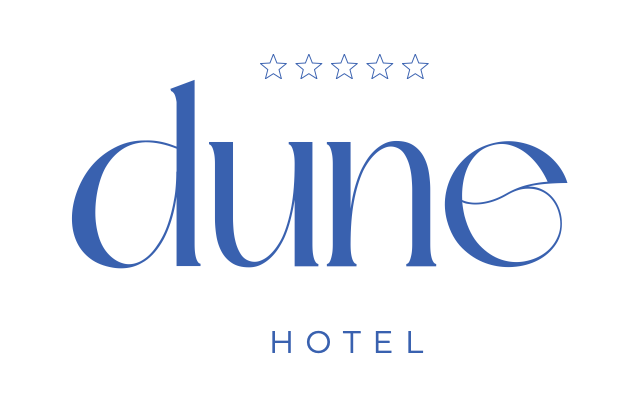
Dune logotype
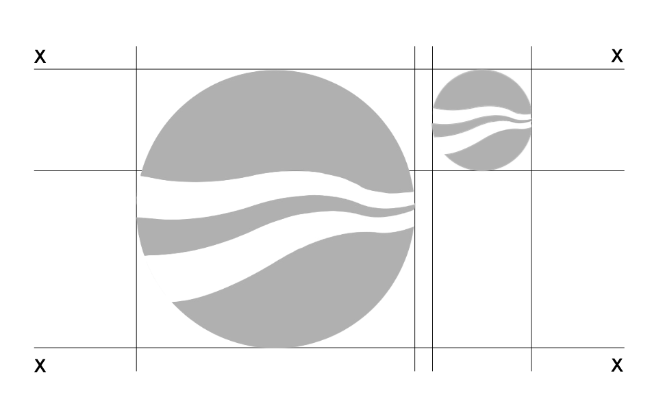
The Dune Hotel logotype is inspired by the organic shape of a dune and a wave: flowing, rounded forms that stand for the calm and harmony of the seaside. The five-star symbol underlines the brand’s premium positioning.
The mark was designed to work both as the full logotype with the word “Hotel” and as a standalone signature, which keeps it flexible across contexts: from small stationery to large-format outdoor ads.
The construction grid is based on precise proportions, and the stroke weights are balanced to stay legible at both small and large sizes.
02. Color
Brand palette
Dune Navy
Sand Gold
Shell White
Deep Night
The Dune Hotel palette comes straight from the seaside landscape: the deep navy of the ocean, the warmth of a sandy shore, the white of seashells and the dark of summer nights. The colors were chosen to convey luxury and calm while staying versatile across media.
03. Typography
Typography system
Headings: Serif
Dune Hotel
H1: DisplayDune Hotel
H2: SubtitleDune Hotel
H3: SectionElegant serif: premium communication
Text / UI: Sans-Serif
Relaxation at its finest. Where the sea meets luxury, and every detail matters.
Legible sans-serif: UI, labels, body
A dual typography system: the serif in headings brings elegance and prestige, while a geometric sans-serif in functional copy keeps things legible and light. Together they capture the brand’s character: classic luxury, contemporary take.
04. Key visual and advertising
Visual communication
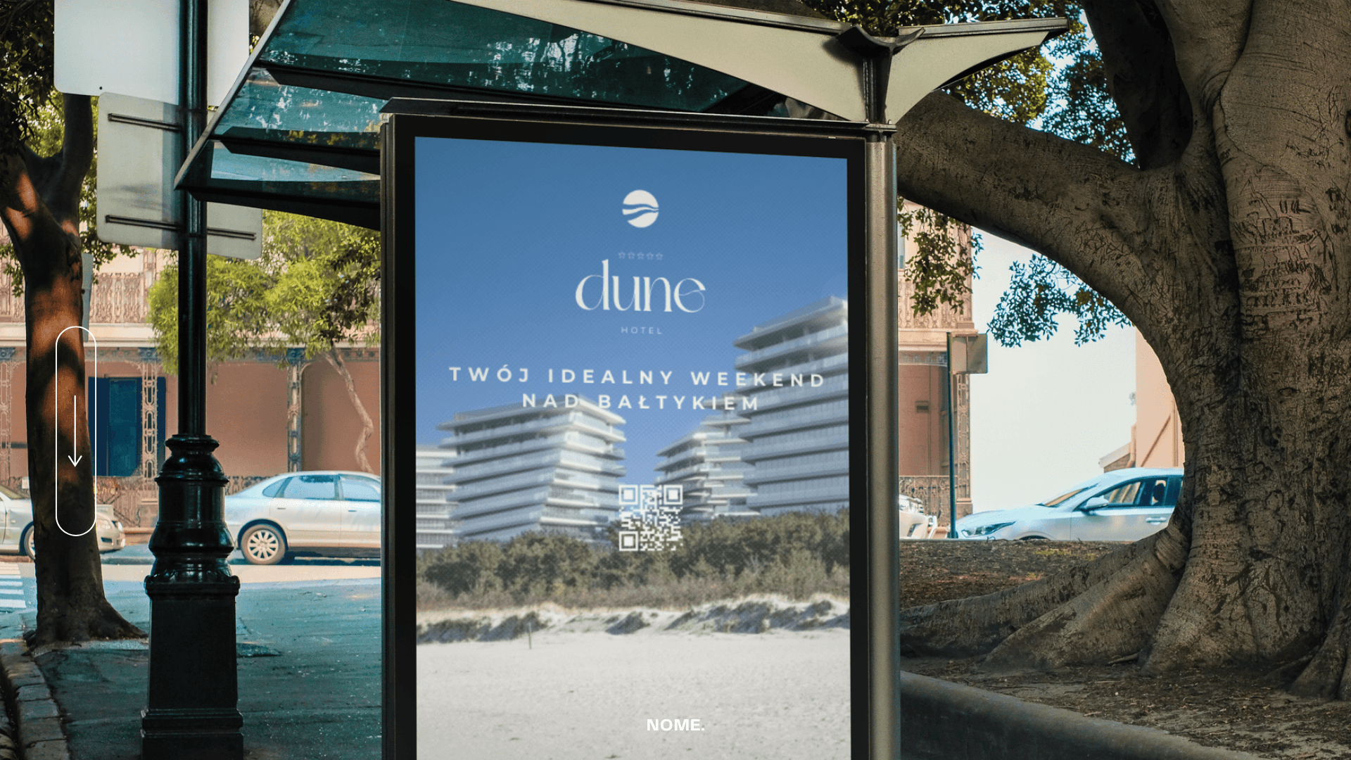
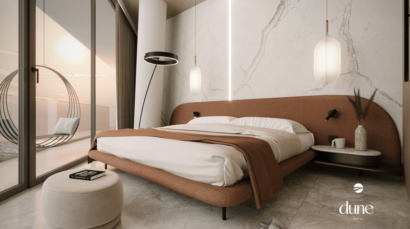
The Dune Hotel key visual pairs seaside landscape photography with minimal typography. The message is simple and clear: “luxury in harmony with nature.” The outdoor materials (citylights, banners) were designed to catch the eye from a distance while keeping an elegant composition.
Outdoor advertising
Citylights, banners and large-format ads designed for maximum visual impact: legible from a distance, with a strong seascape key visual.
Hotel amenities
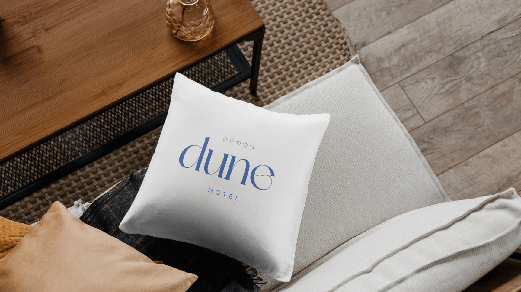
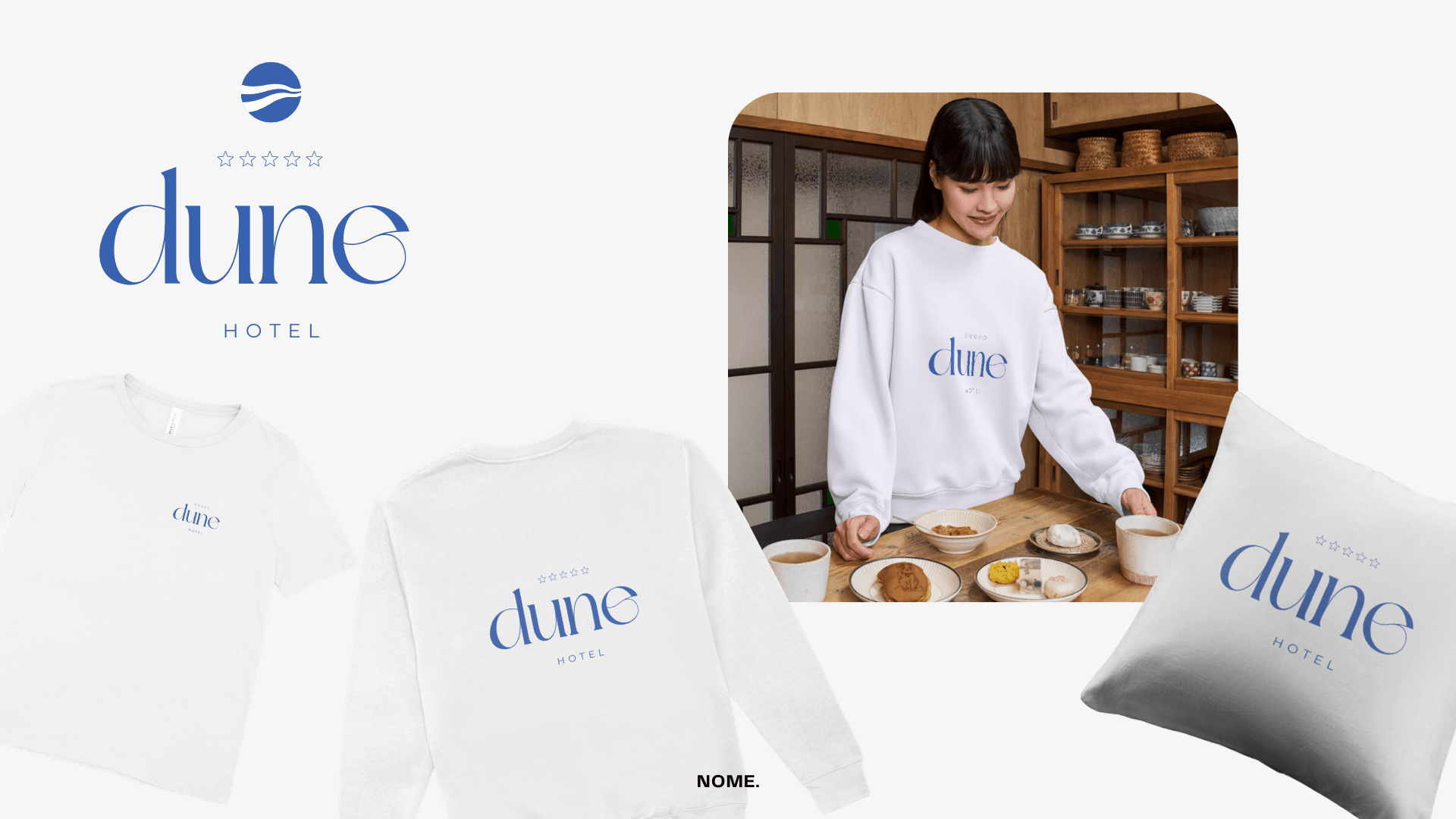
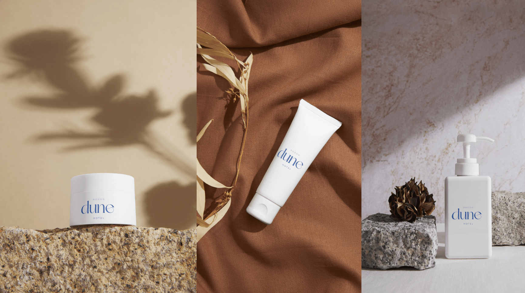
Pillows, towels, cosmetics, beach bags and stationery: every item in the guest rooms and shared spaces carries consistent Dune Hotel branding.
Uniforms & merch
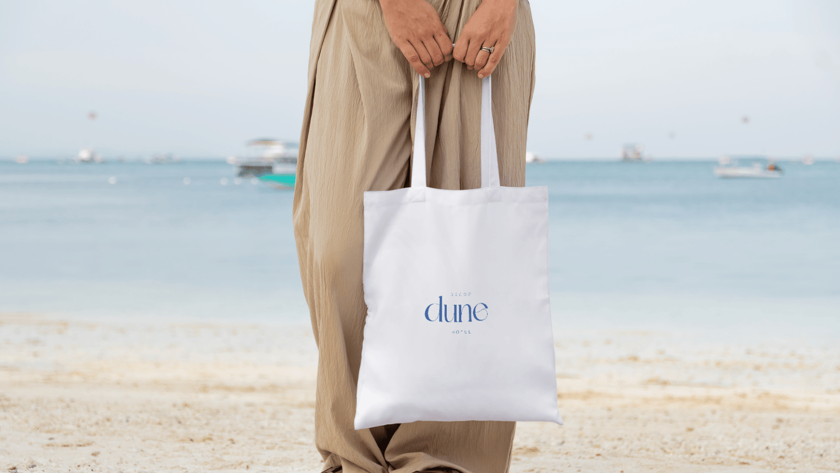
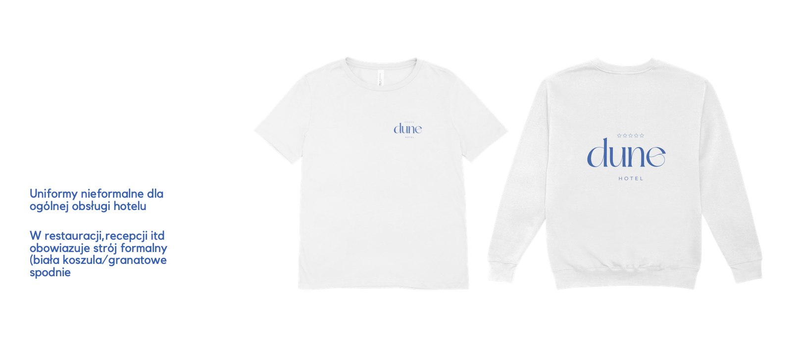
Polo shirts, sweatshirts and bags for the staff, designed in the brand’s muted palette: elegant, comfortable and instantly recognizable.
05. Merch and applications
Every detail
The Dune Hotel visual system was designed around every point where guests meet the brand: from first seeing an ad, through check-in, to the stay in their room. Uniforms, merch and hotel cosmetics add up to a consistent, memorable experience.
50+
Designed elements
4
Material categories
2
Logo color variants
1
Consistent branding system
06. Process
From concept to identity
Phase 01
Research & Brief
An analysis of the premium hotel market in Poland, competitor benchmarking, and defining the target audience and brand positioning. The brief called for elegance without pretension.
Phase 02
Concept & Moodboard
Developing a visual direction based on the seaside landscape: dunes, waves, sand. A moodboard combining nature photography with minimal typography.
Phase 03
Logo & System
Designing the logotype on a construction grid and choosing the color palette, typography system and graphic elements. Testing legibility at different scales.
Phase 04
Applications & Touchpoints
Preparing materials for every brand touchpoint: from outdoor ads, through hotel merch and cosmetics, to stationery and digital communication.
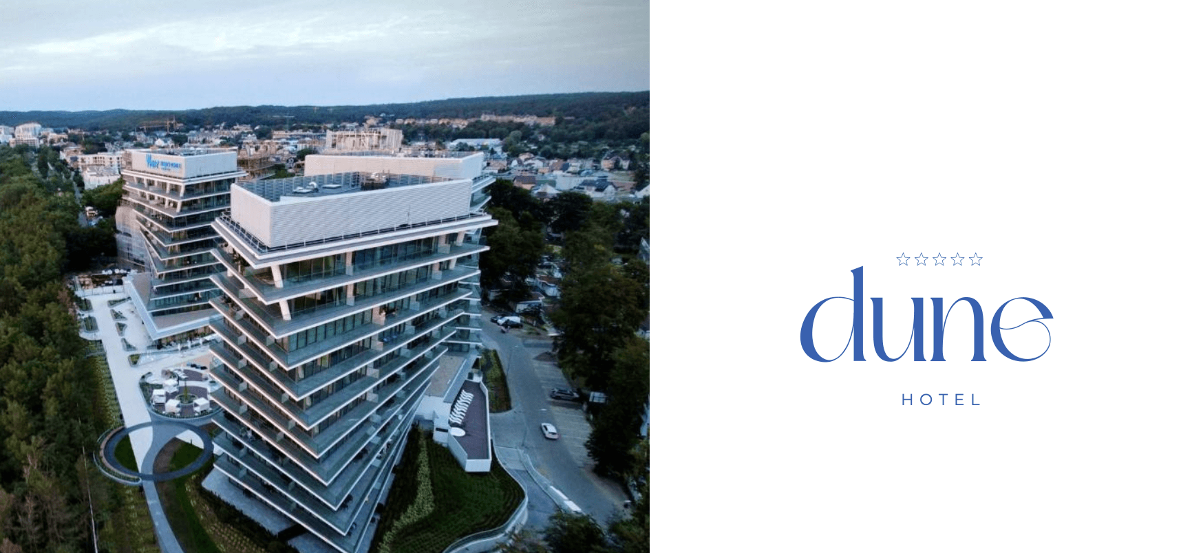
The starting point was bringing together the hotel’s architecture and the seaside landscape. The logo is inspired by the shape of a dune and a wave: organic, yet elegant. Typography that pairs a serif with a grotesque underlines the brand’s luxurious but approachable character.
The visual system was designed for a wide range of applications: from outdoor advertising (citylights, banners), through hotel materials (merch, key cards, menus), to digital communication. Every touchpoint builds a consistent Dune Hotel brand image.
Project scope
- Brand strategy and positioning
- Logotype with a construction grid
- Color palette and typography system
- Key visual and photography
- Outdoor materials (citylight, banner)
- Hotel merch (apparel, bags, pillows)
- Hotel cosmetics line
- Staff uniforms