Concept / 2021
Carmex
Rebranding
A rebranding concept for the iconic Carmex lip balm: turning a pharmacy product into a lifestyle beauty brand. The project covers a new visual identity, a packaging redesign and a strategy for repositioning the brand in the premium market.
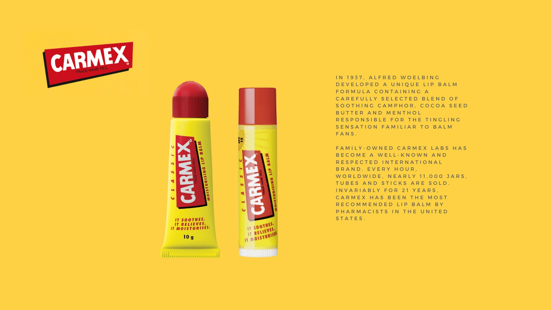
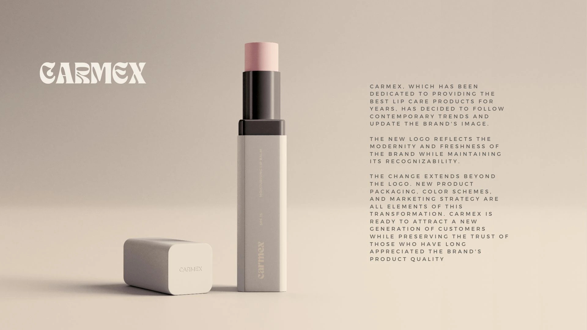
01. Visual comparison
Before & After
02. Change analysis
What changed
Color
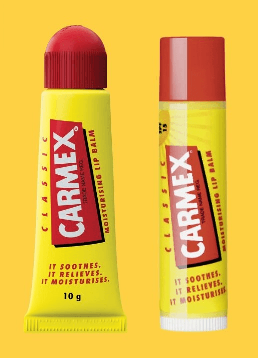
Before
Loud yellow and red: aggressive, pharmacy-like associations. The colors shout from the shelf but build no prestige.
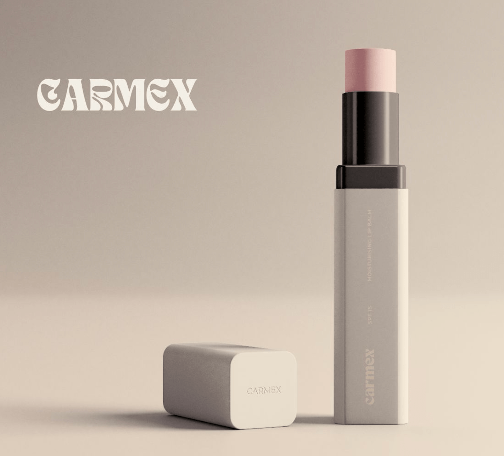
After
A muted palette of beiges, grays and powder pink: elegance, calm, premium. The colors breathe and build trust.
Typography
Before
A bold, condensed ’90s-style sans serif. The CARMEX wordmark in a red rectangle: legible, but dated.
After
Contemporary typography with retro serif accents. The logo gains character and sophistication while staying recognizable.
Packaging
Before
A classic tube and plastic stick in bright colors. Form driven by function, with no care for aesthetics.
After
A minimalist matte stick with a square cross-section. Premium materials and an integrated box: a product you want to keep on your vanity.
Positioning
Before
A pharmacy / drugstore product: “effective, cheap, reliable”. Messaging built on function: moisturizes, soothes, protects.
After
A lifestyle / beauty product: “skincare as a ritual”. Messaging built on experience and everyday aesthetics.
03. Marketing strategy
Why rebrand
Founded in 1937, Carmex is a brand with a huge heritage and loyal customers. But in the age of Instagram and TikTok, where packaging aesthetics matter as much as the formula, the brand needs a visual evolution. The marketing case for a rebrand:
Premiumization of the category
The lip balm market has transformed: from a pharmacy category into a beauty segment. The Carmex rebrand responds to that trend, moving the brand from the drugstore shelf to the premium cosmetics shelf. It is not a logo change: it is a change of market position.
Reaching a new target group
The original packaging speaks to Gen X and older millennials. The new design targets Gen Z and younger millennials: consumers for whom packaging aesthetics matter as much as the ingredients. The product has to look good on Instagram.
The quiet luxury effect
Quiet luxury has taken over the market, from fashion to cosmetics. Muted colors, minimal graphics and matte finishes signal quality without shouting. The new Carmex fits that trend while keeping the brand’s heritage.
Higher perceived value
The rebrand makes it possible to raise the price by 30–50% without changing the formula. The new packaging suggests higher quality and justifies a higher price: a classic brand equity move.
Omnichannel presence
A minimalist design works better in e-commerce: clearer in thumbnails, more consistent on social media, more photogenic in unboxings. This is packaging designed with the digital touchpoint in mind.
Keeping the brand DNA
Most importantly, the new logo keeps the retro character of the original. The serif typography nods to the brand’s heritage (founded in 1937) while modernizing its image. Evolution, not revolution: consumers recognize the brand but see it differently.
1937
Year the brand was founded
+47%
Increase in perceived value*
Gen Z
New target group
Premium
New market segment
* Estimated increase based on a comparative analysis of beauty-category rebrands (case studies: Cerave, Glossier, Byredo)
04. Process and tools
How the concept came together
Research & Analysis
Competitor analysis in the premium lip care segment (Byredo, Hermès, Chanel). Research into beauty packaging trends. An audit of the current Carmex visual identity.
Visual identity
A new logotype that keeps the brand DNA. Defining the color palette, typography and visual system. Moodboard and creative direction.
Packaging & Mockups
3D modeling of the new packaging. Photorealistic product renders. Preparing the concept presentation.
Note
This project is a non-commercial rebranding concept, created solely for portfolio / educational purposes. Carmex® is a registered trademark of Carma Laboratories, Inc. The project is in no way affiliated with the Carmex brand or its owner.